Morris Heights Health Center (MHHC)
Project Story
Role: Design Lead, Marketing and Communications
Before I took over design across departments, MHHC’s materials were inconsistent and underdeveloped. Materials often didn’t adhere to the very basics of the brand and many within the organization didn’t know a brand existed. I introduced consistent layouts, popular secondary colors, official fonts and a visual look that allowed for flexibility depending on the audience.
Branding Guidelines
The most important part of any brand development project is establishing guidelines for how the brand should be applied across traditional and digital media. Below is a flipbook of the brand guidelines I created for MHHC. I introduced new fonts, colors, and rules for how the logo could be altered and applied, along with guidance for keeping the brand consistent across different types of media.
Scroll through the flipbook below to take a look.
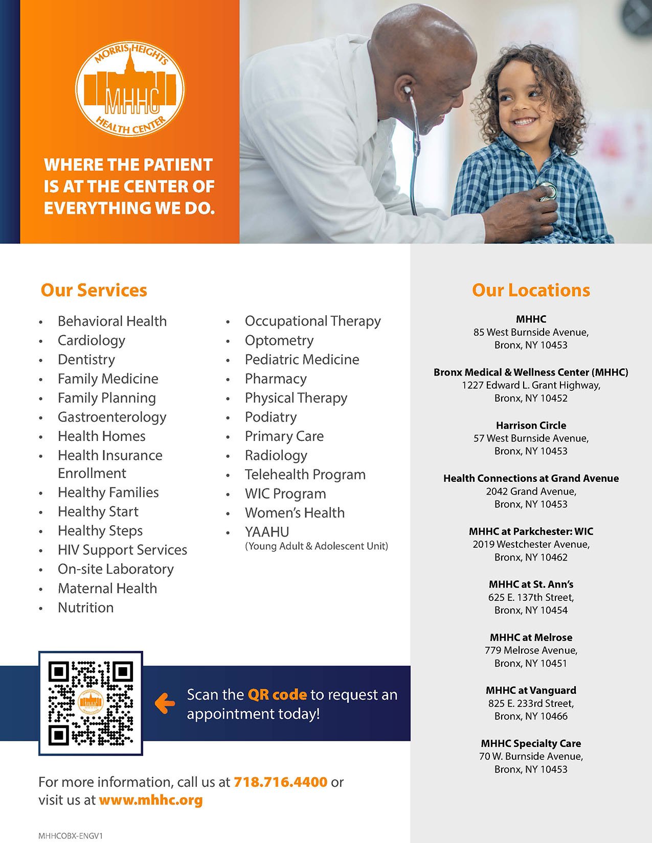
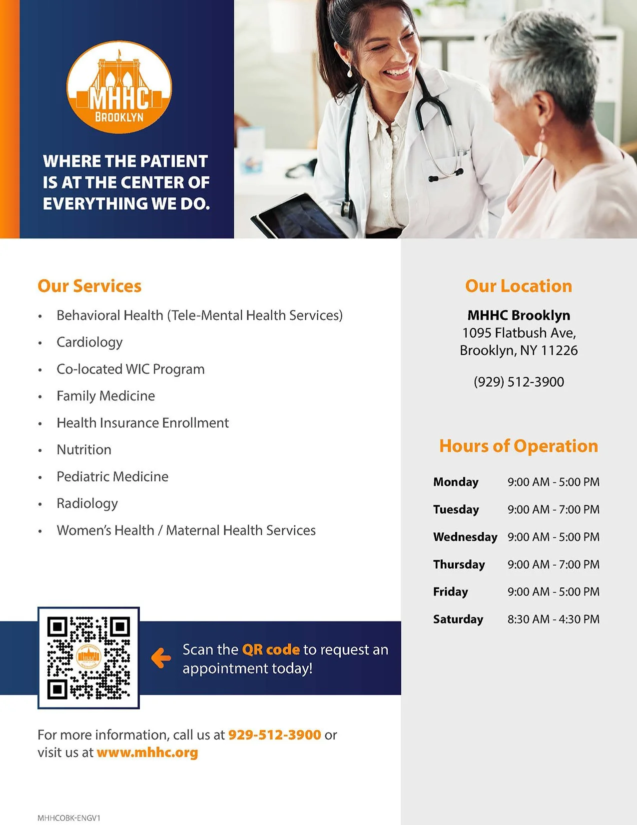
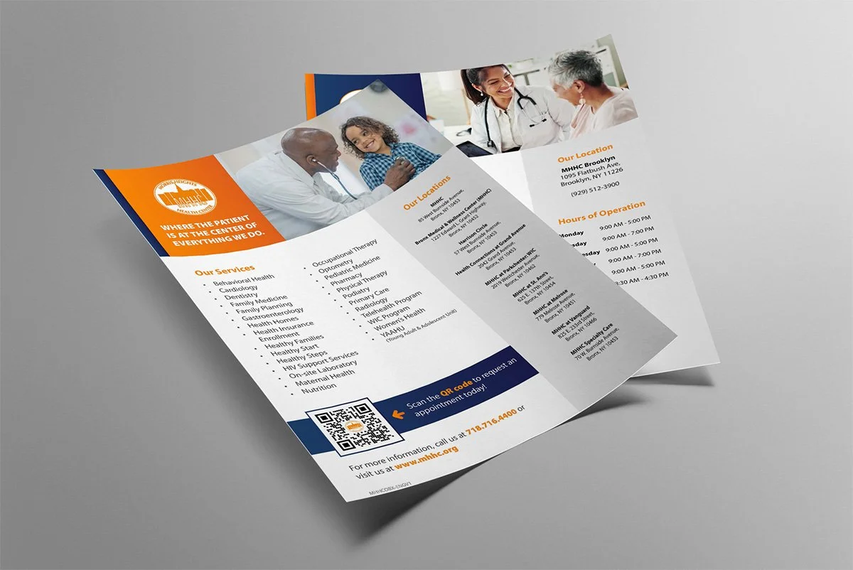
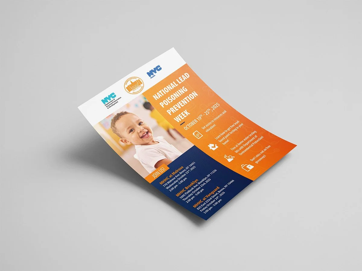
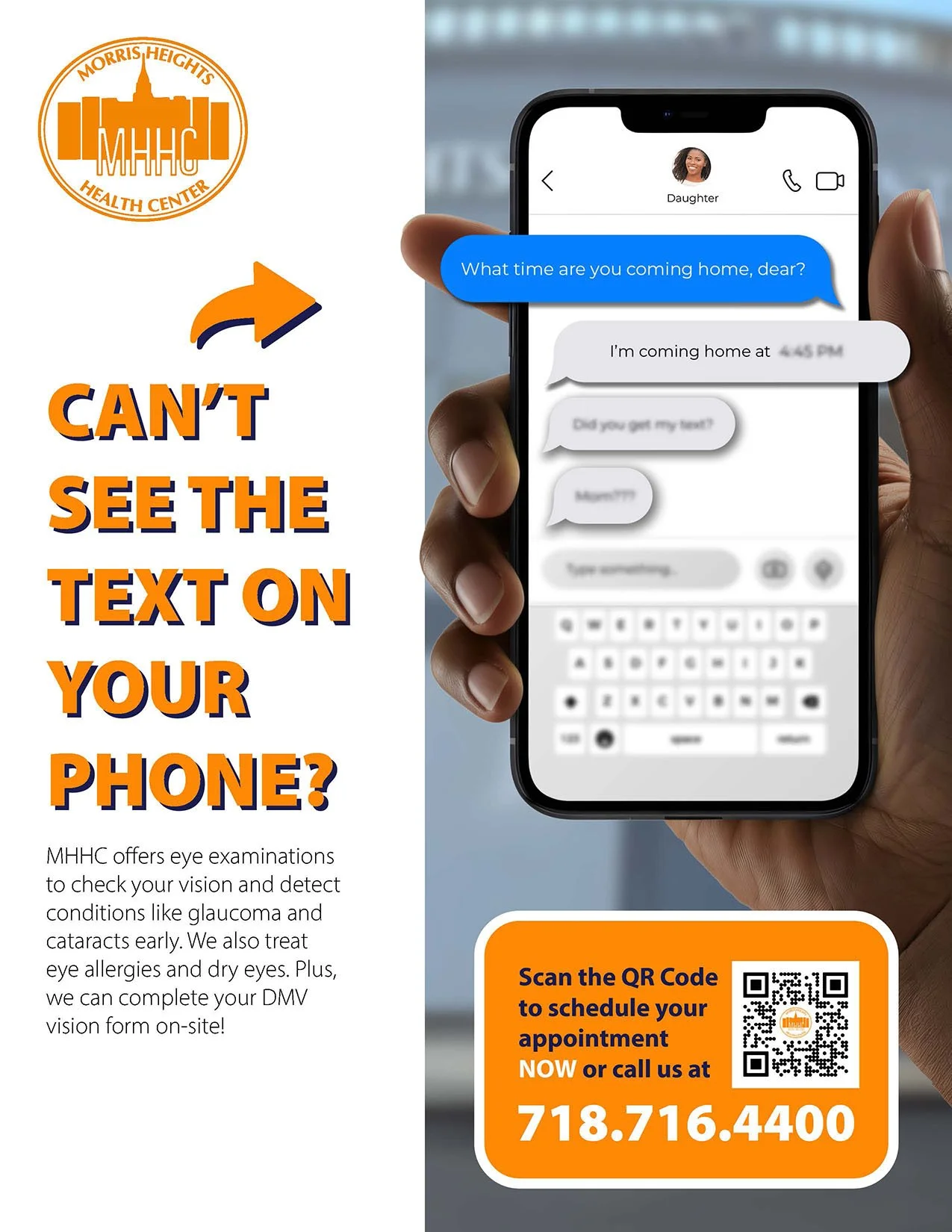
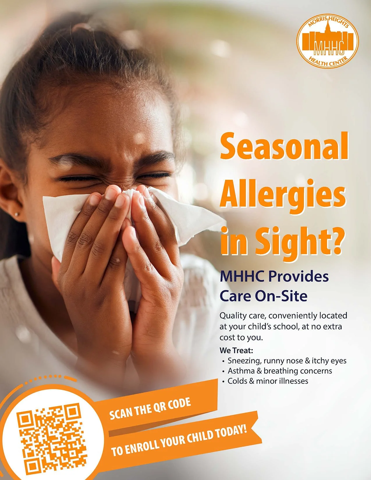
Marketing Materials: Flyers & Brochures
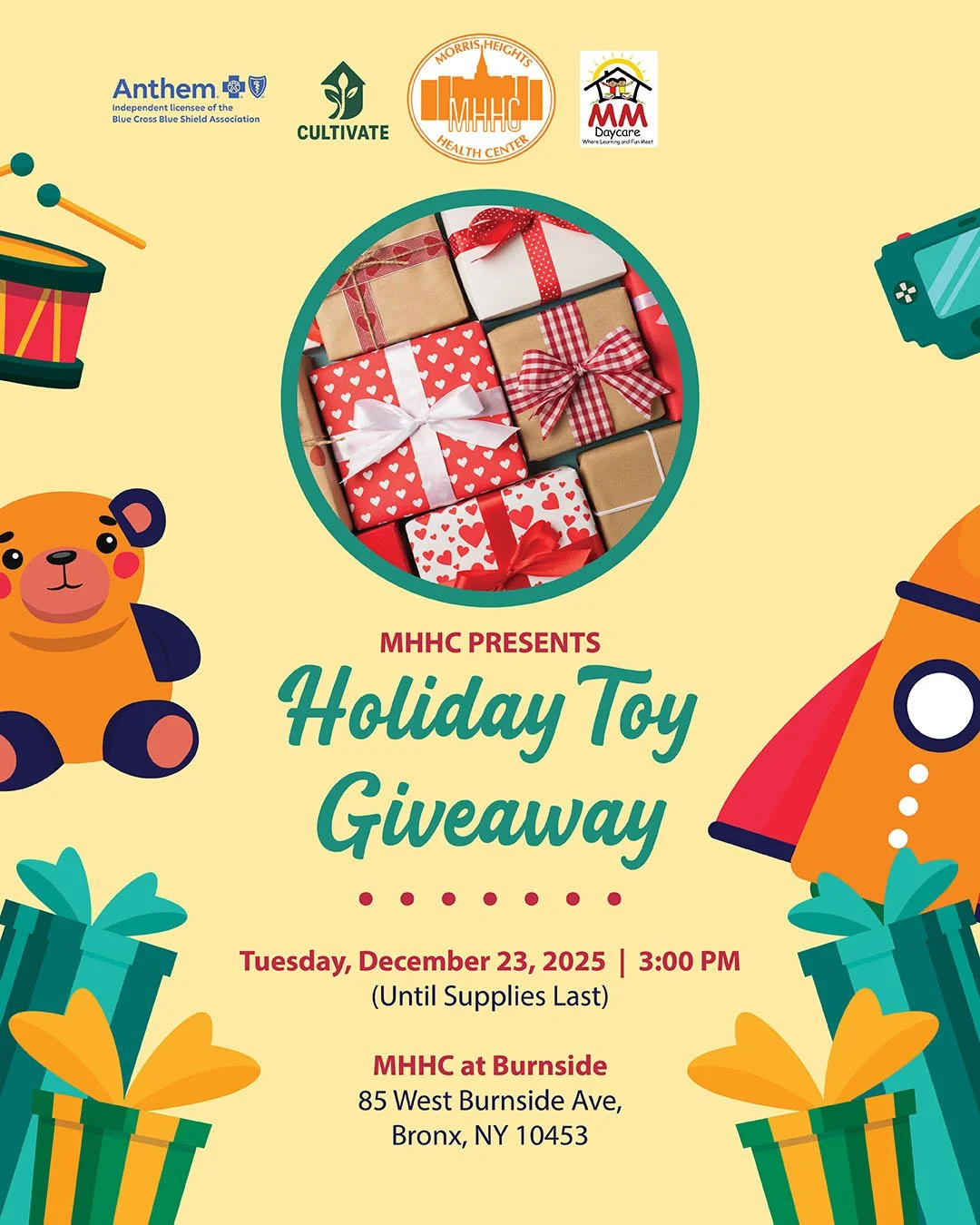
I designed a high volume of marketing materials across multiple departments, often with very little direction. I took ownership of undeveloped ideas, set the visual strategy, and built them into a clear and consistent design strategy across print and digital. The goal was to create work that felt recognizable, structured, and connected, no matter the audience.

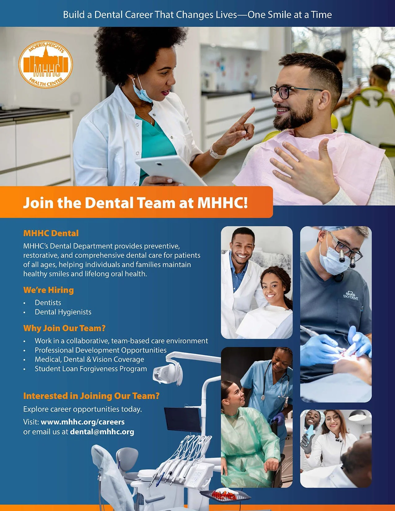
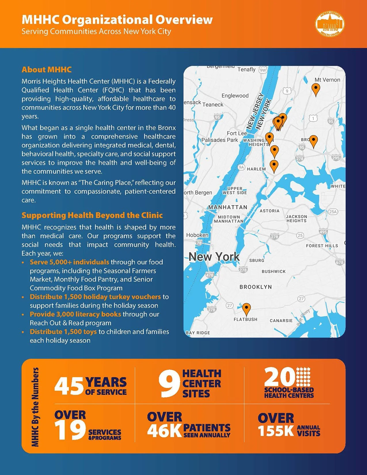
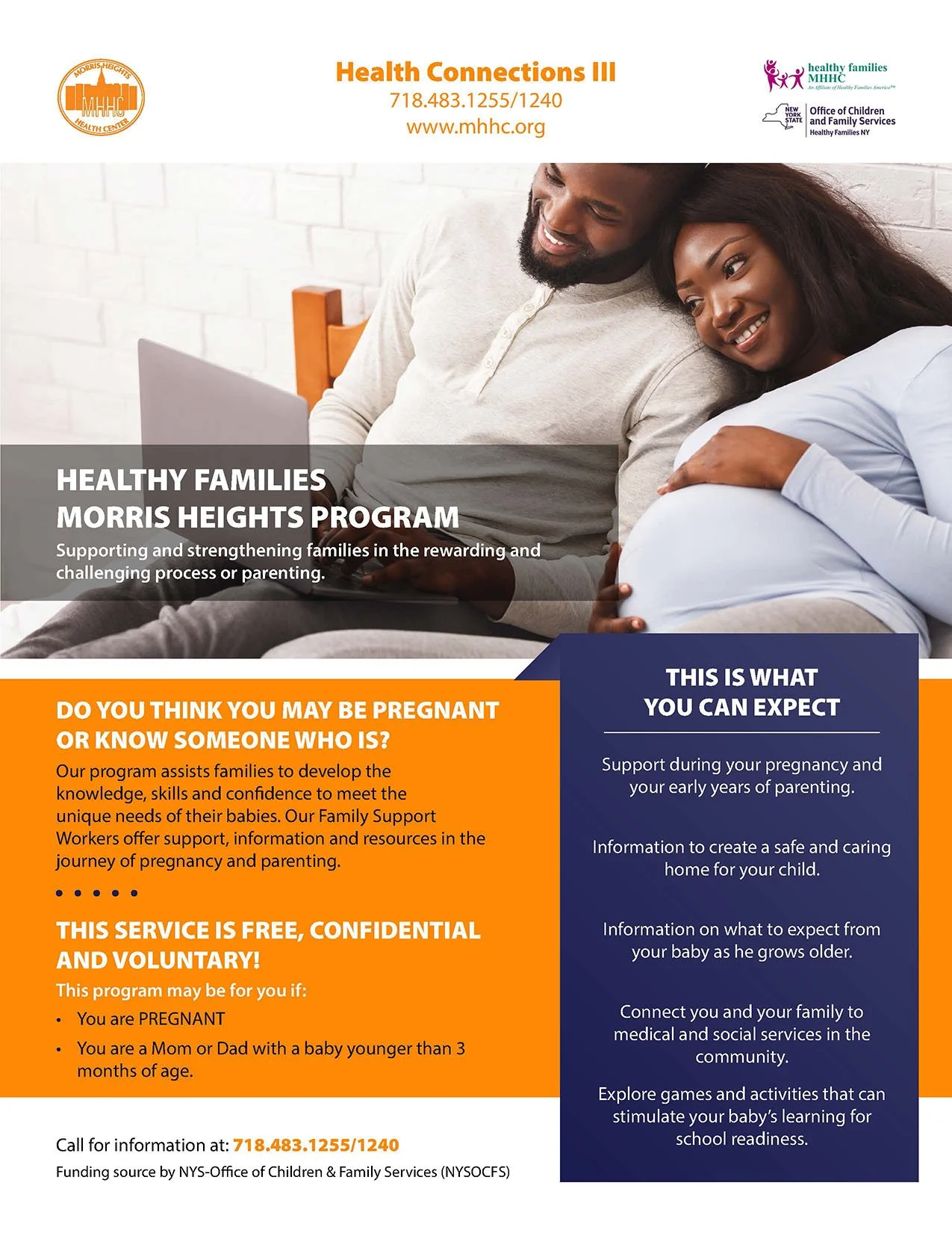
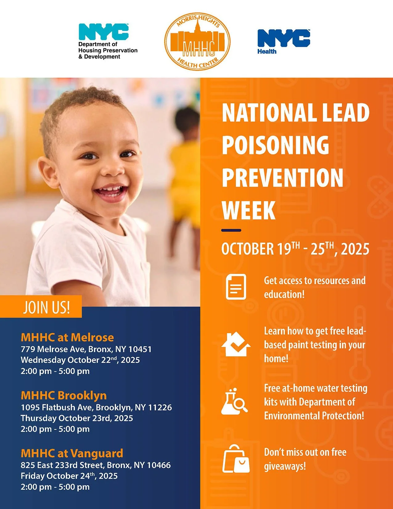

Posters & Signage
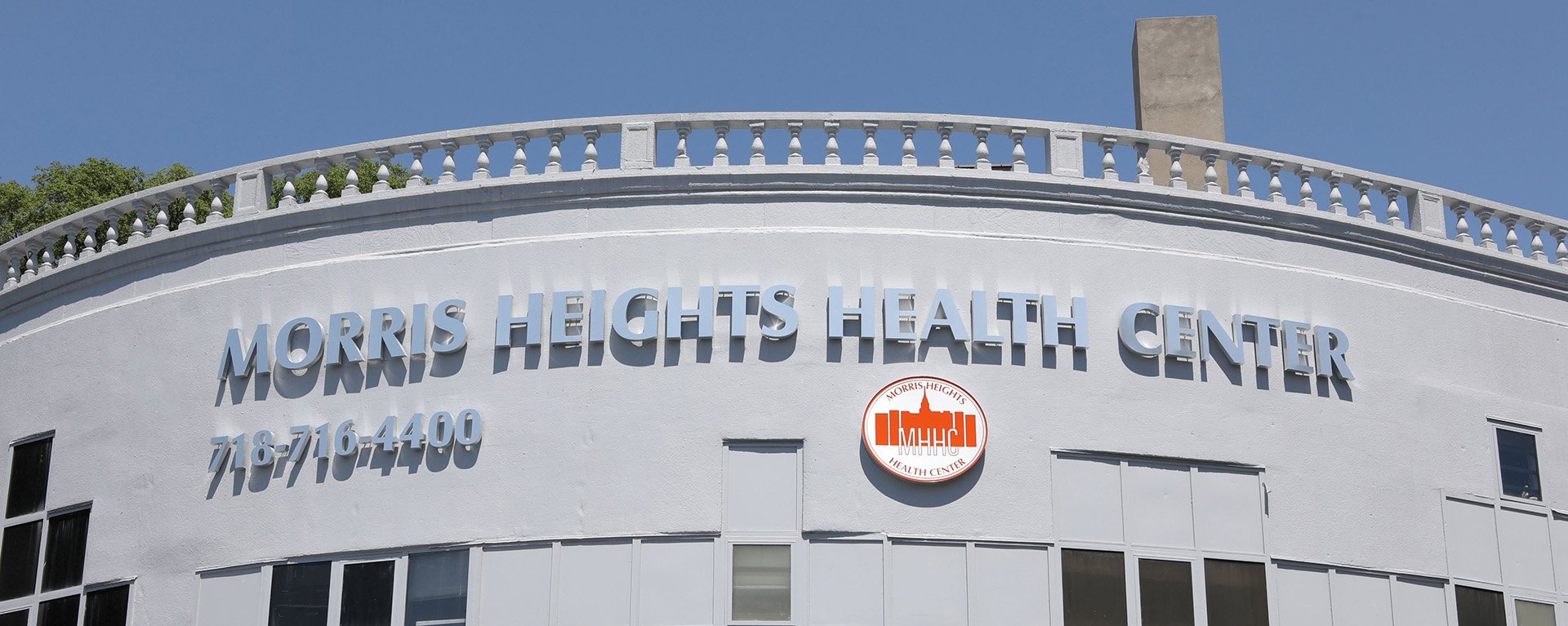
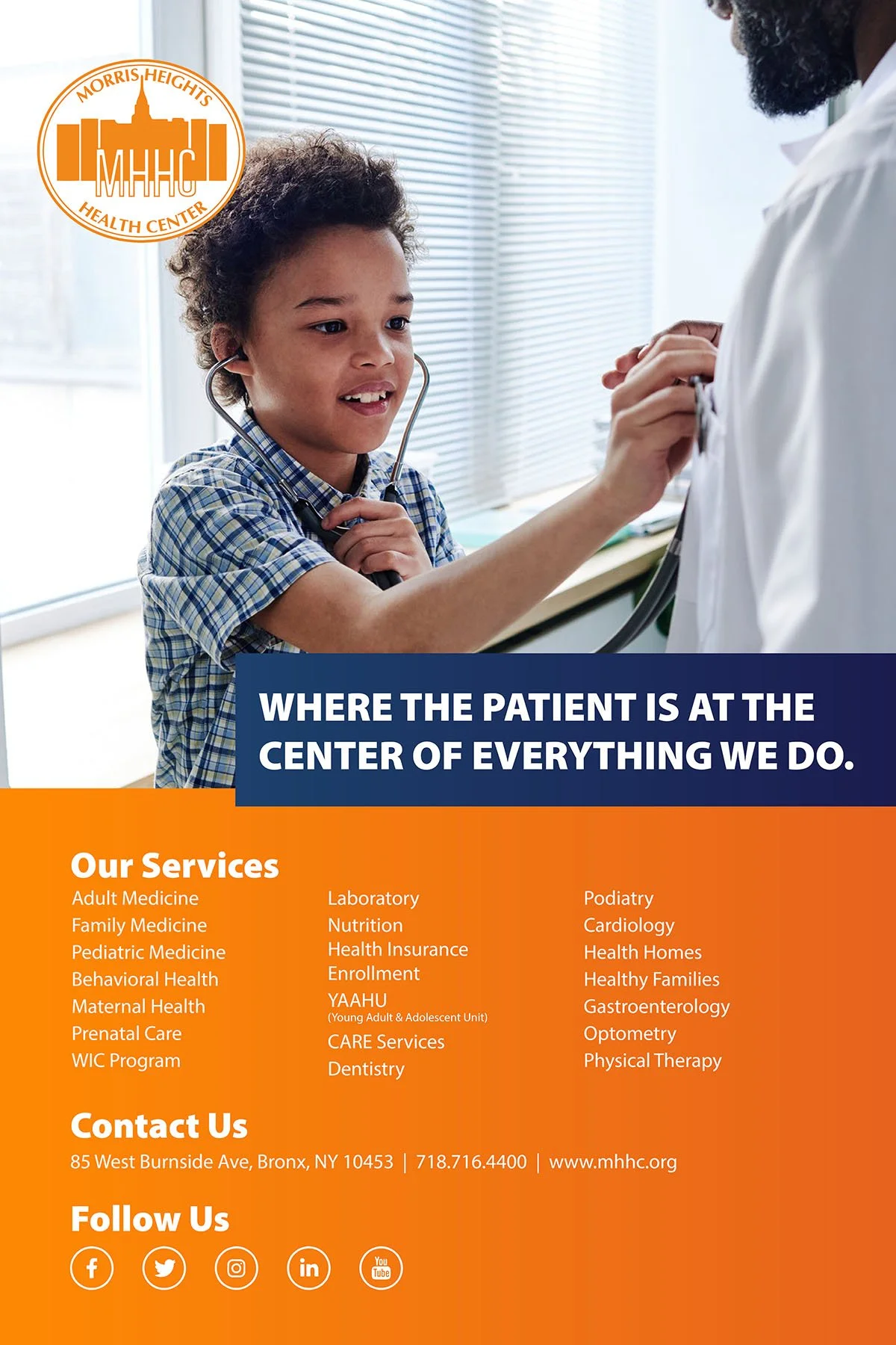
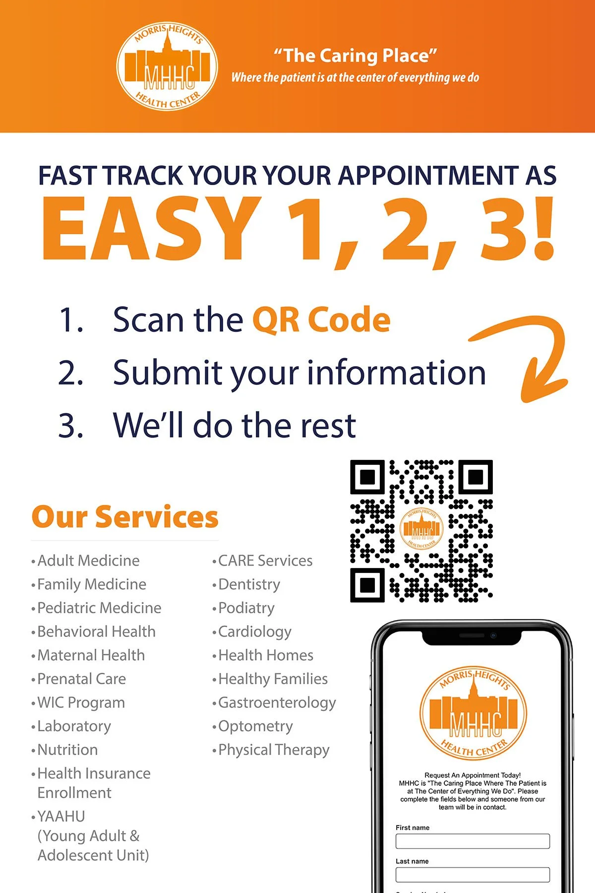
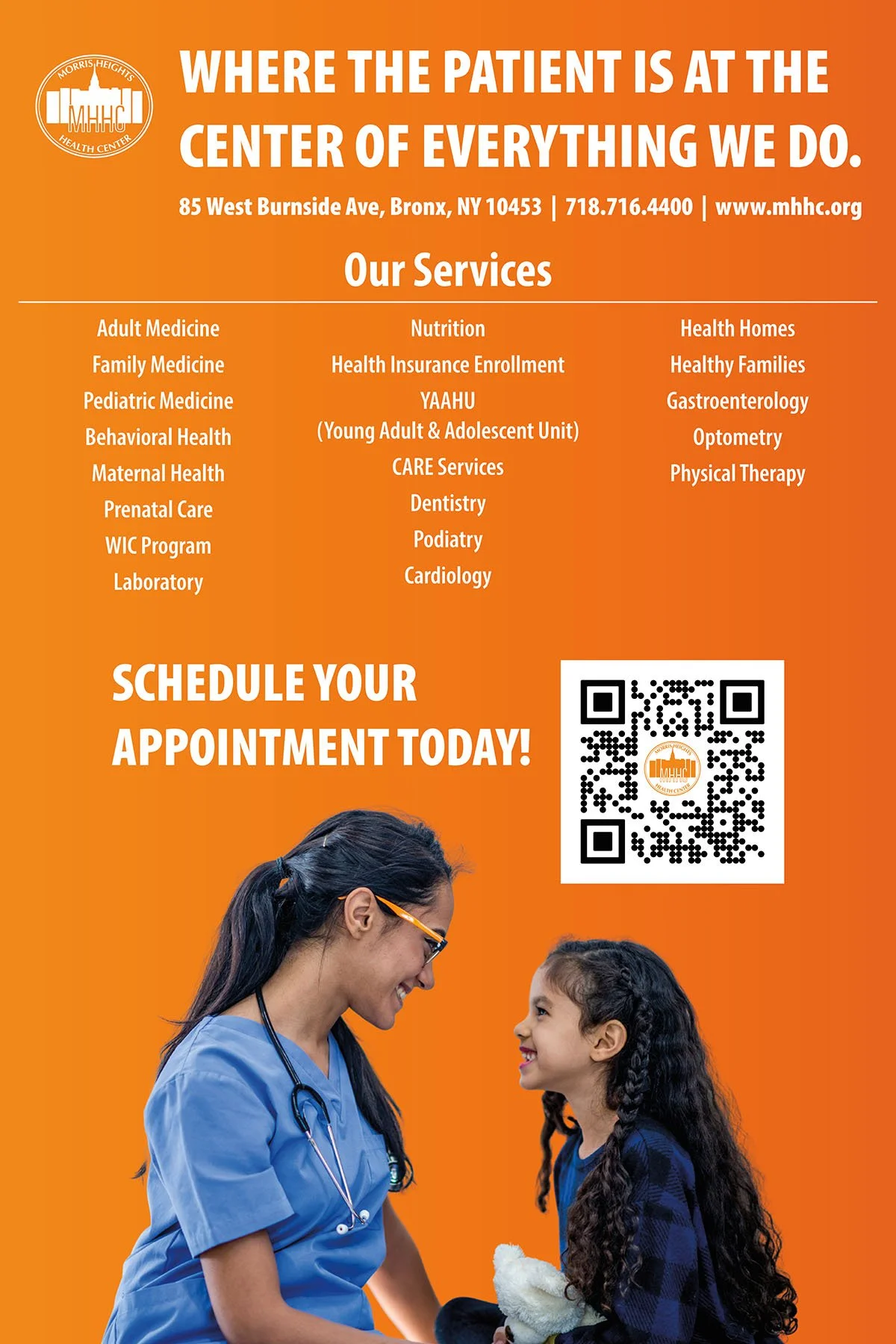
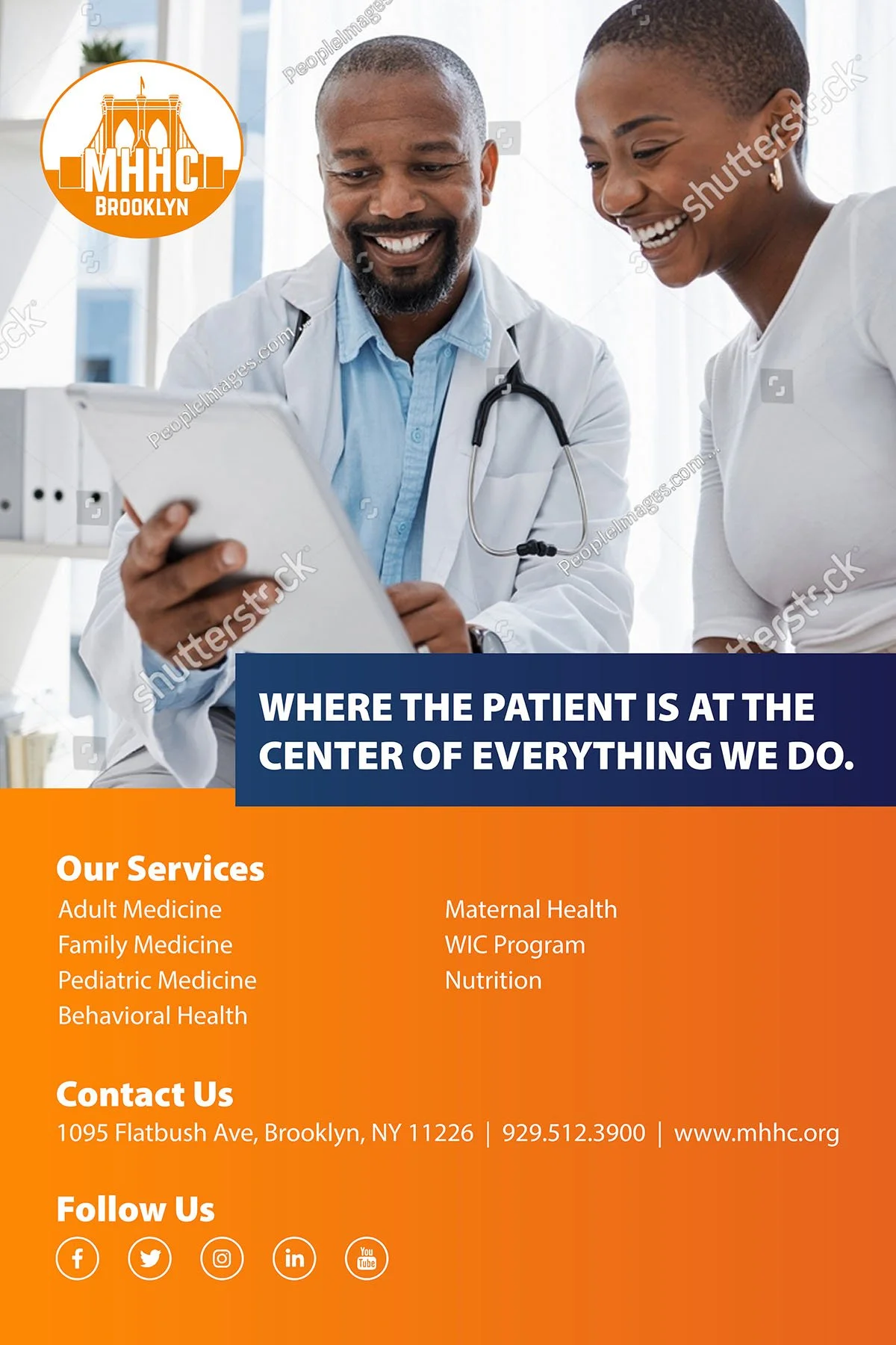
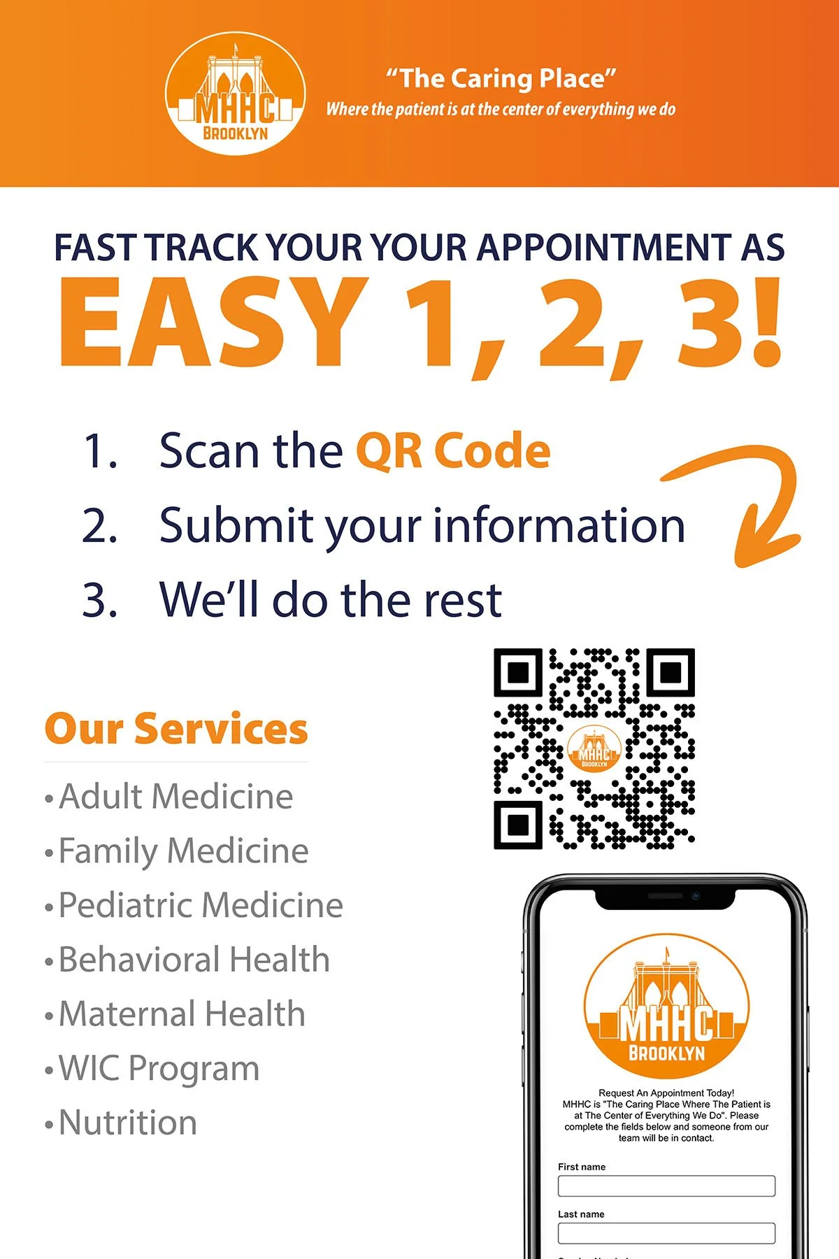
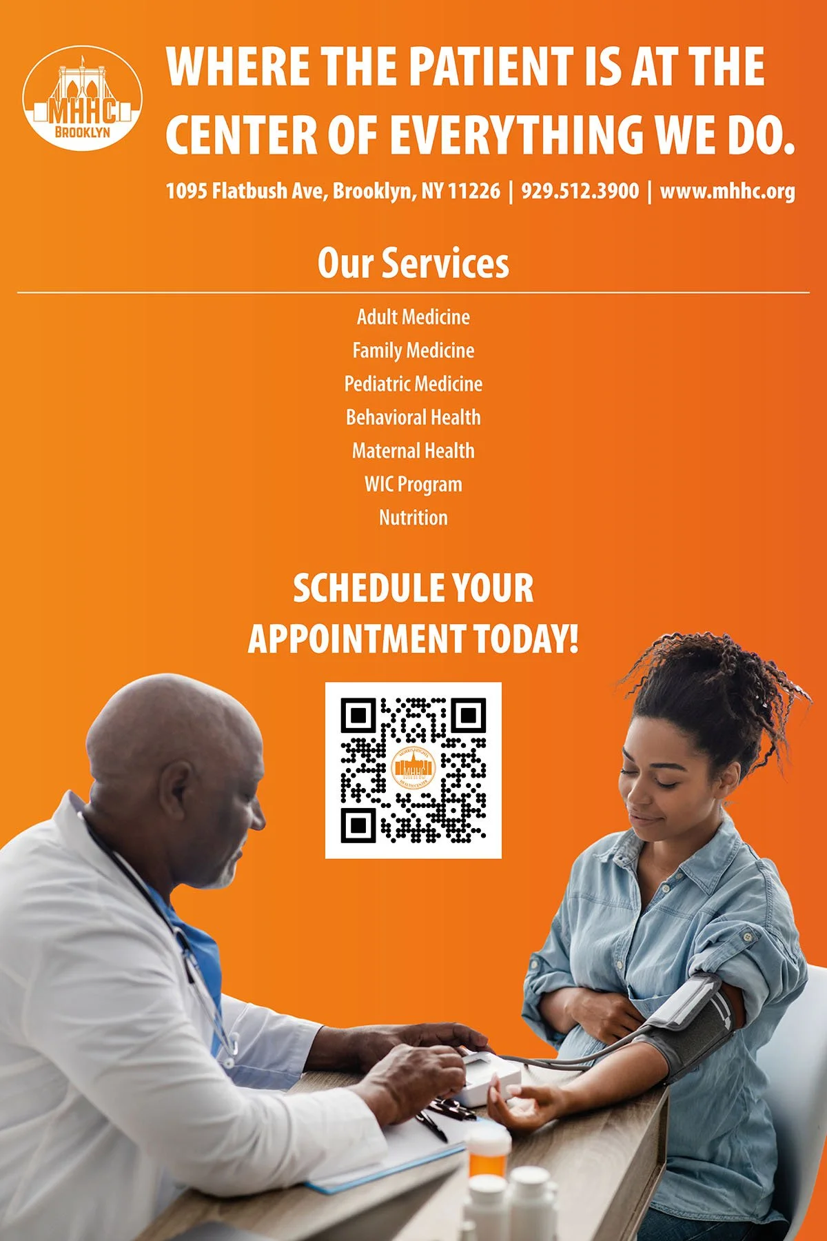
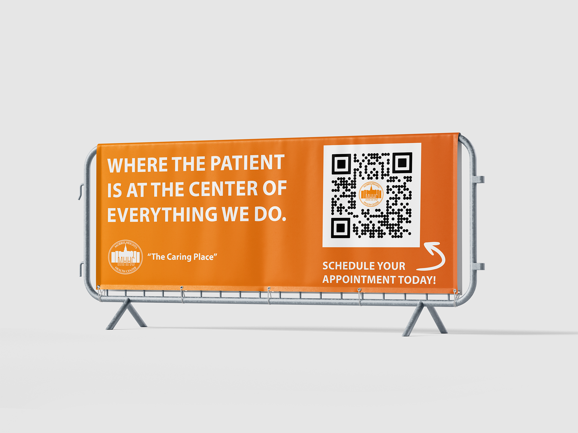
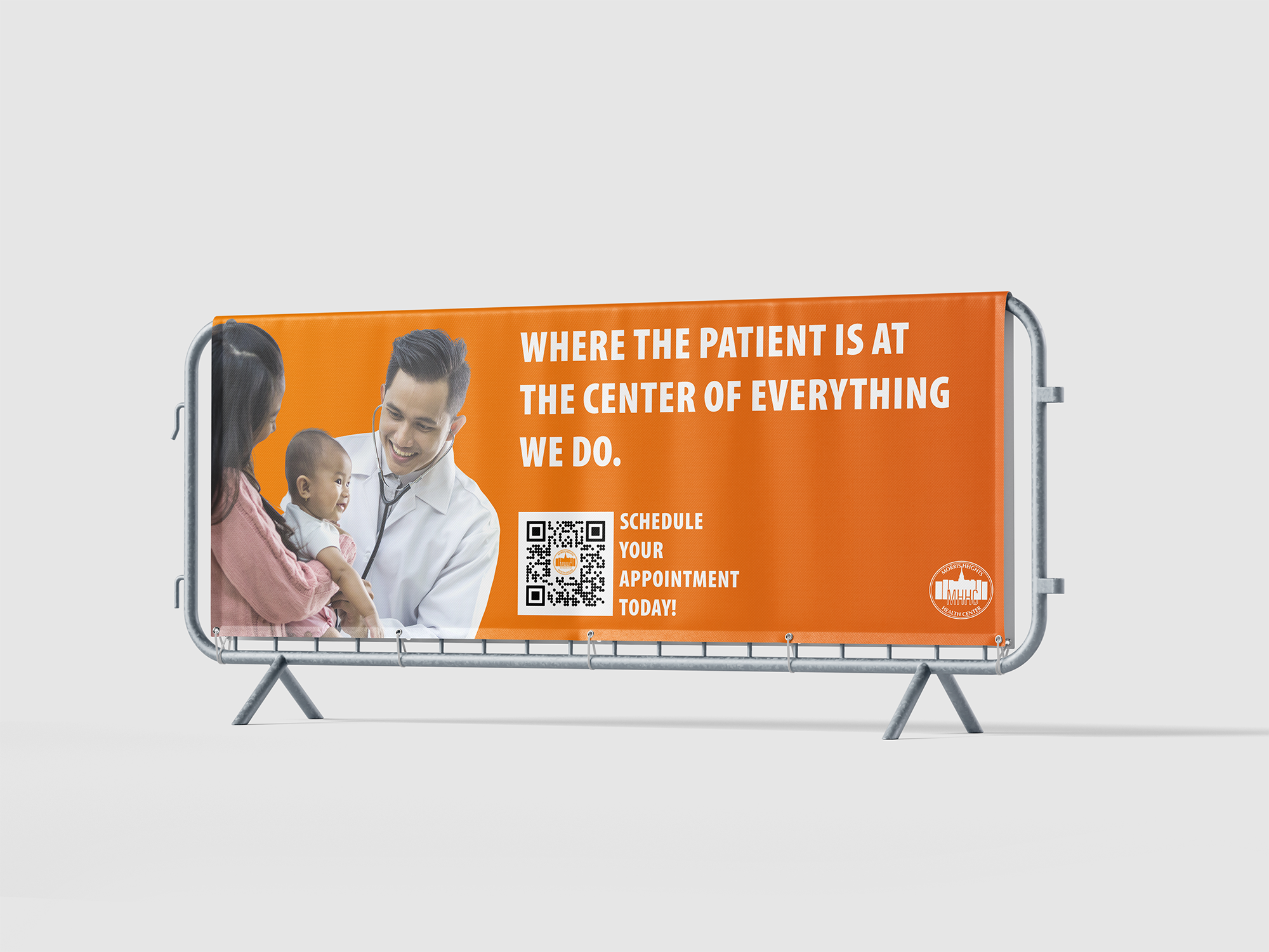
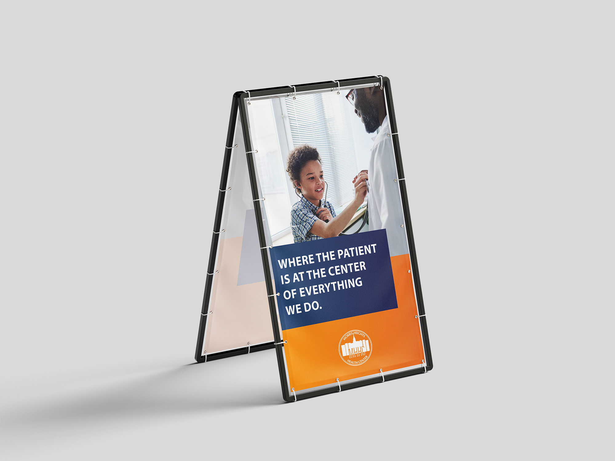
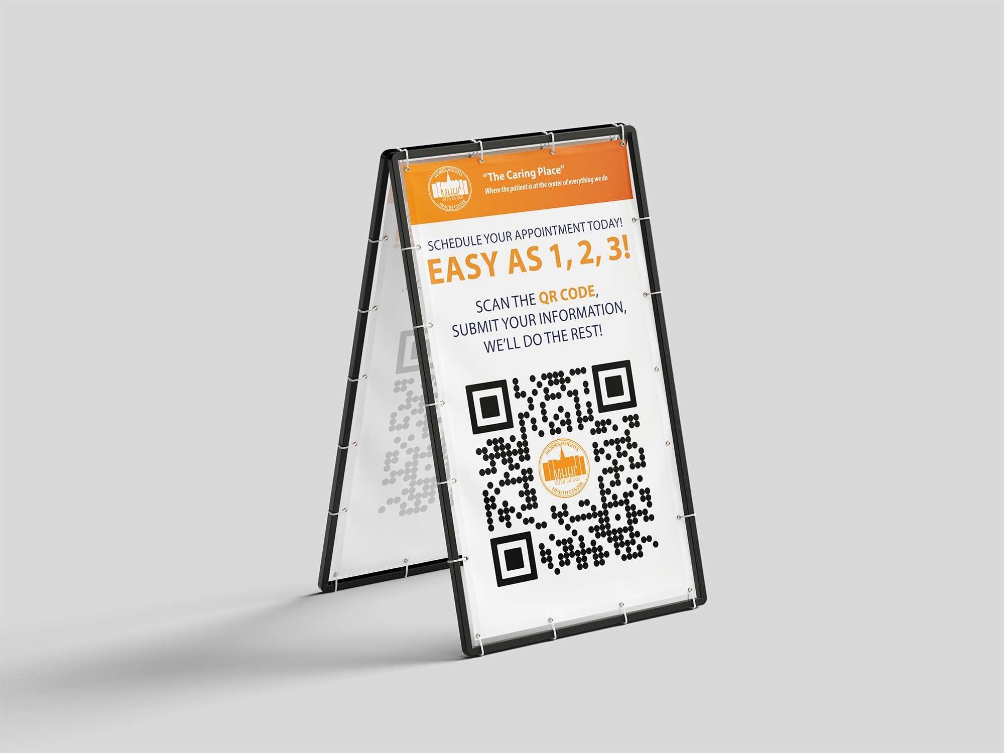
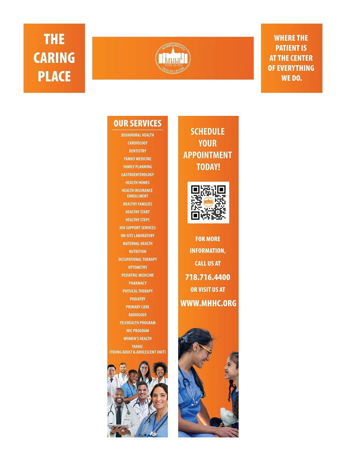
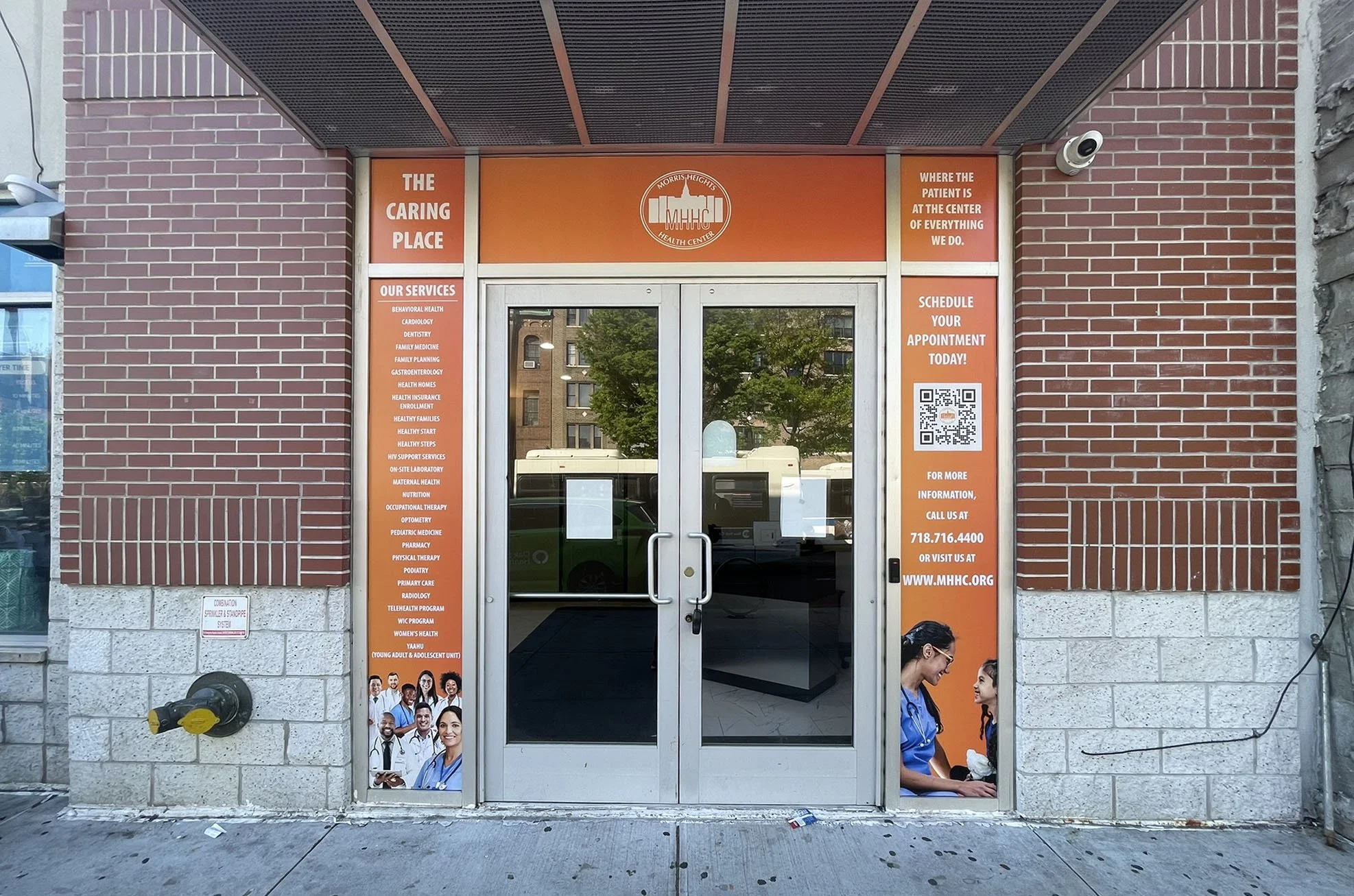
Part of MHHC’s overall marketing strategy is the use of signage and posters. The thinking was simple: something big and visually strong would be more likely to catch the attention of prospective patients.
With that in mind, I made orange a major part of the visual direction for most of our signage. I felt that using it prominently in a real-world environment would help the work stand out and immediately grab the attention of the community.
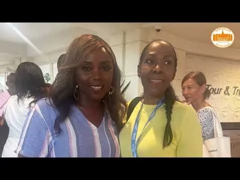
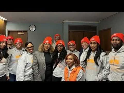
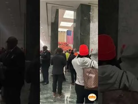
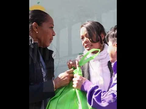
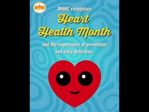
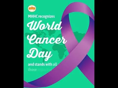
MHHC recently started using video and animation as another way to drive patient visits. I wanted the videos to feel consistent with the rest of the brand, while still giving myself room to experiment. I tested different graphics, layouts, and animation styles to see what worked best at keeping viewers engaged.
Video
Social Media
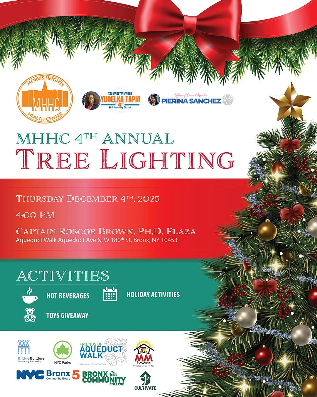
One of MHHC’s goals was to grow its social media presence. I wanted the consistency I had established across our other marketing materials to carry over into social media as well. Our official colors and typography already lend themselves to being bold and eye-catching, so I made sure those elements played a major role, especially in posts that were more marketing focused.




What I Learned
I learned how to lead the design and development of a brand focused on community outreach and traditional marketing. I also learned that modern marketing tactics don’t work for every audience, and that traditional media like flyers, posters, and signage can still be extremely effective.
More than anything, I learned how to wear many hats and step outside of design when needed to better understand the community and communicate with them on their level.